Blinkit Ambulance Onboarding
Problem statement
Blinkit recently announced its Ambulance Services, aligning with their rapid response mechanics. This project explores a swipe-based onboarding animation to introduce users to the new service. The animation guides users through the main features announced so far: Affordability, Equipment Availability and Medical Professionals.
Design

For the Foreground assets and Background, overall soft colors relating to Blinkit’s color palette were incorporated.
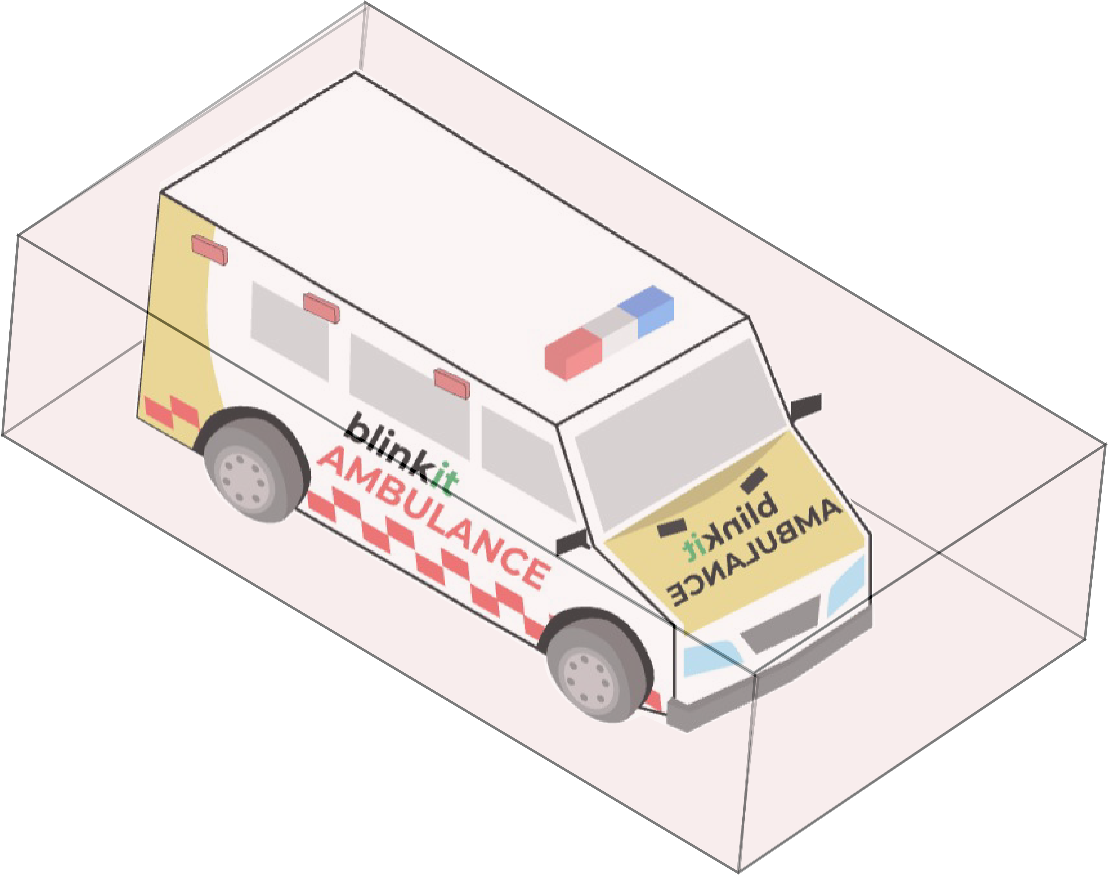
The Ambulance and Medical professionals design were directly inspired by the visuals provided by Blinkit's announcement post.


Isometric 3D: All foreground elements have an isometric 3D perspective to facilitate spatial motion.

Motion Approach
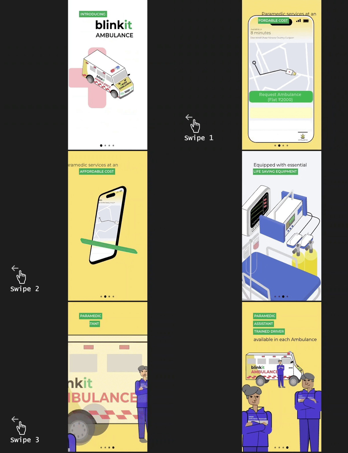
The motion system was planned to highlight these four main pointers as Idle states:
Introduction: Introduces users to the service and emphasises how it aligns with the Blinkit family and its rapid response formula.
Affordability of Service: Highlights the cost-effectiveness of using the service.
Availability of Necessary Equipment: Reassures users that ambulances are fully equipped.
Trained Medical Professionals: Highlights the authenticity of qualified medical personnel.
The framework of this project depended on the relationship between these features. Hence, initial ideation for the visual transitions was planned first.


The individual elements of each feature were animated in a faux 3D perspective, which further transformed into the next feature's assets.
This gives a sense of spatial movement corresponding to each physical swipe.
A single narrative was grafted incorporating all the ideal states together through transition animations. It gave a sense of a product lookbook to the whole onboarding motion.

Idle state 1
Transition state 1
Idle state 2
Transition state 2
Idle state 3
Transition state 3
Idle state 4
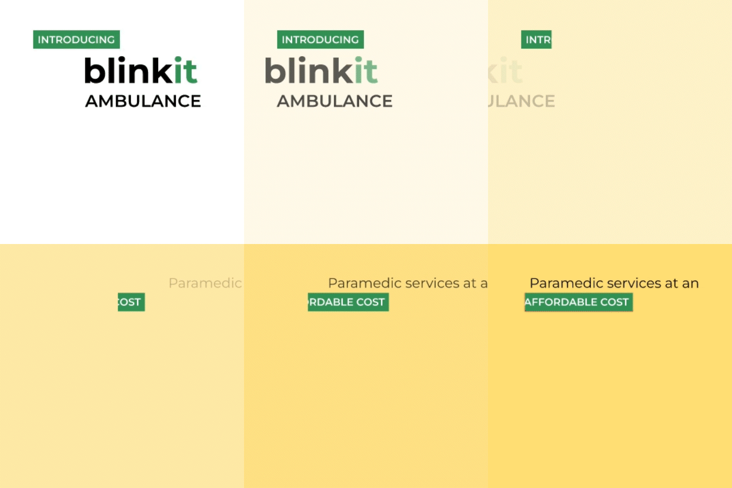
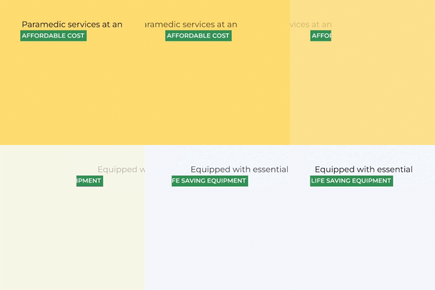
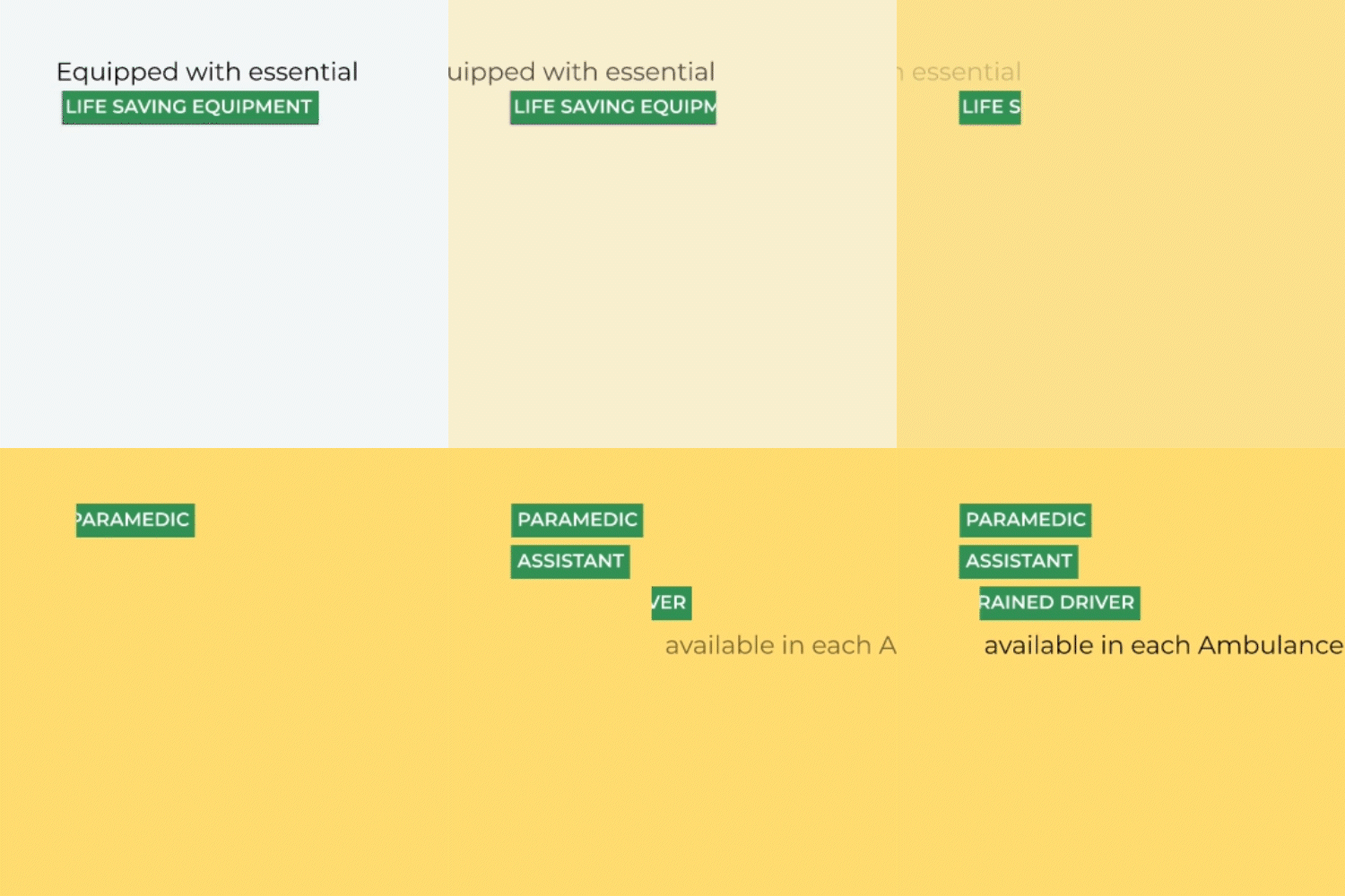
The text motion sequentially highlighting the features were also designed to align directly with right to left information flow.
Interaction System
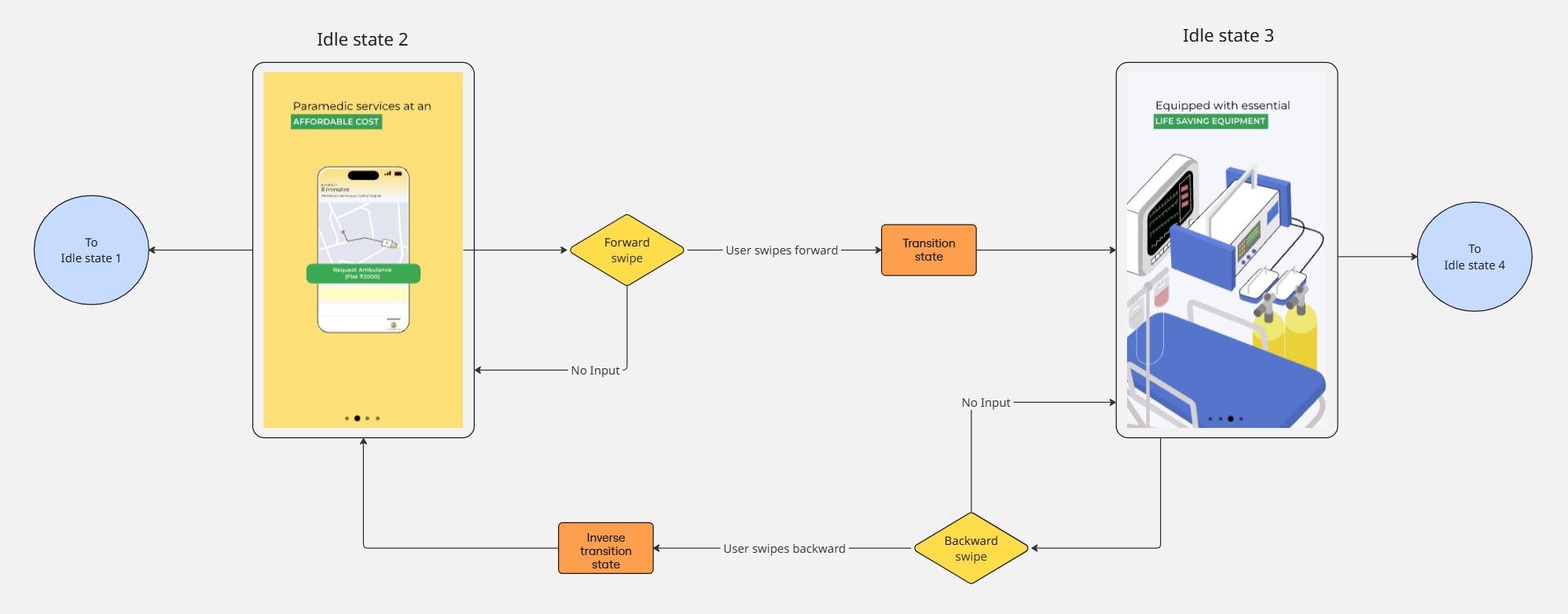
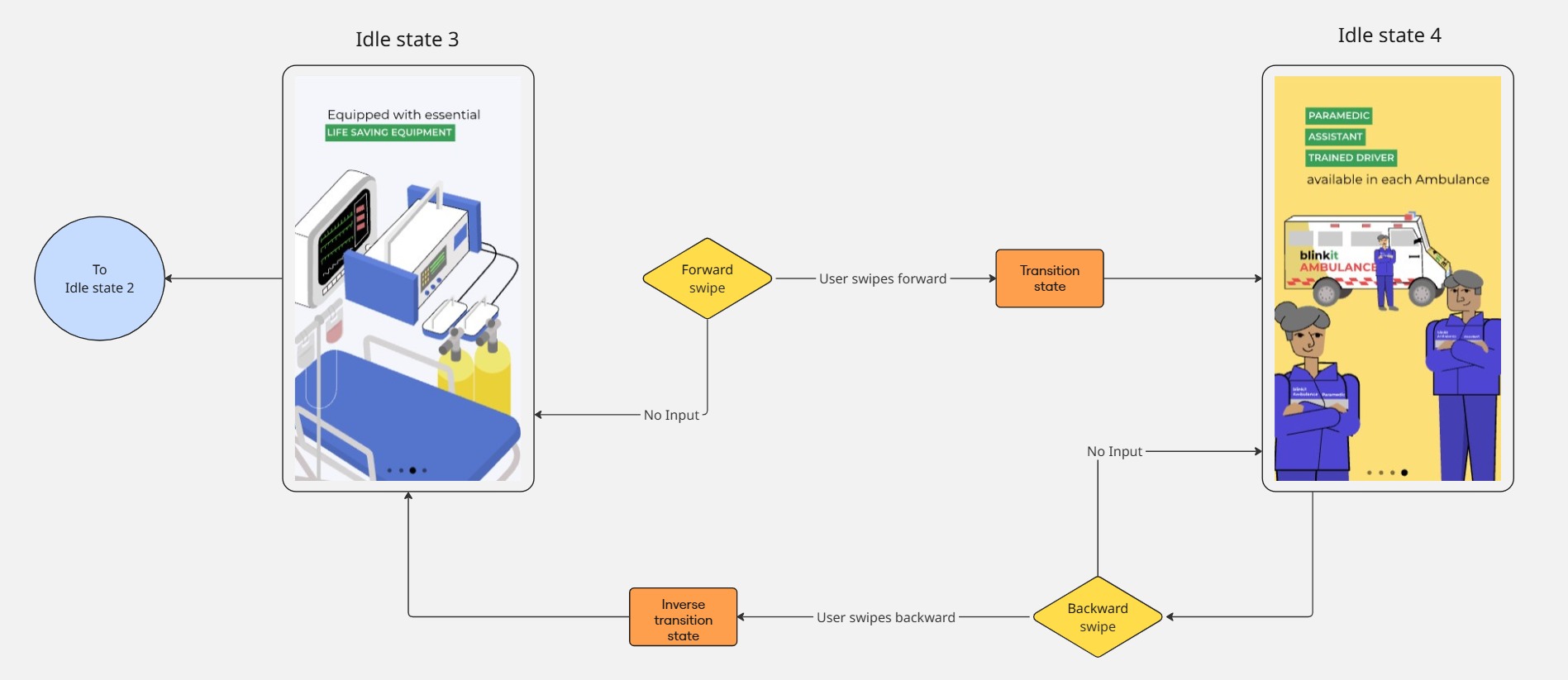
Like most onboarding motion experiences, a swipe-based gestural UI was chosen.
In this case, along with the dynamic transitions, it facilitated non-linear navigation for repeated user interaction.
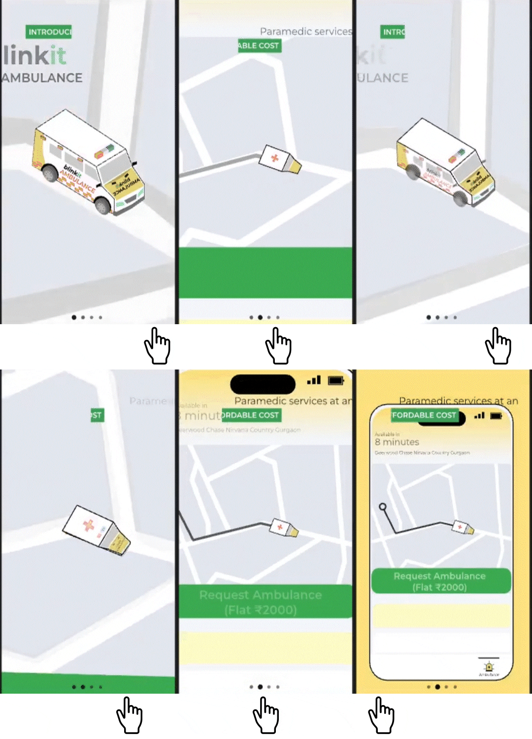
4 idle states and 3 transition states were decided, corresponding to 3 swipe movements.
First swipe: Transition from Introduction (Idle state 1) to Affordability of Service (Idle state 2).
Second swipe: Transition from Affordability of Service (Idle state 2) to Availability of Necessary Equipment (Idle state 3).
Third swipe: Transition from Availability of Necessary Equipment (Idle state 3) to Trained Medical Professionals (Idle state 4).

Final Prototype
