Book My Show Seat Selection


Problem statement
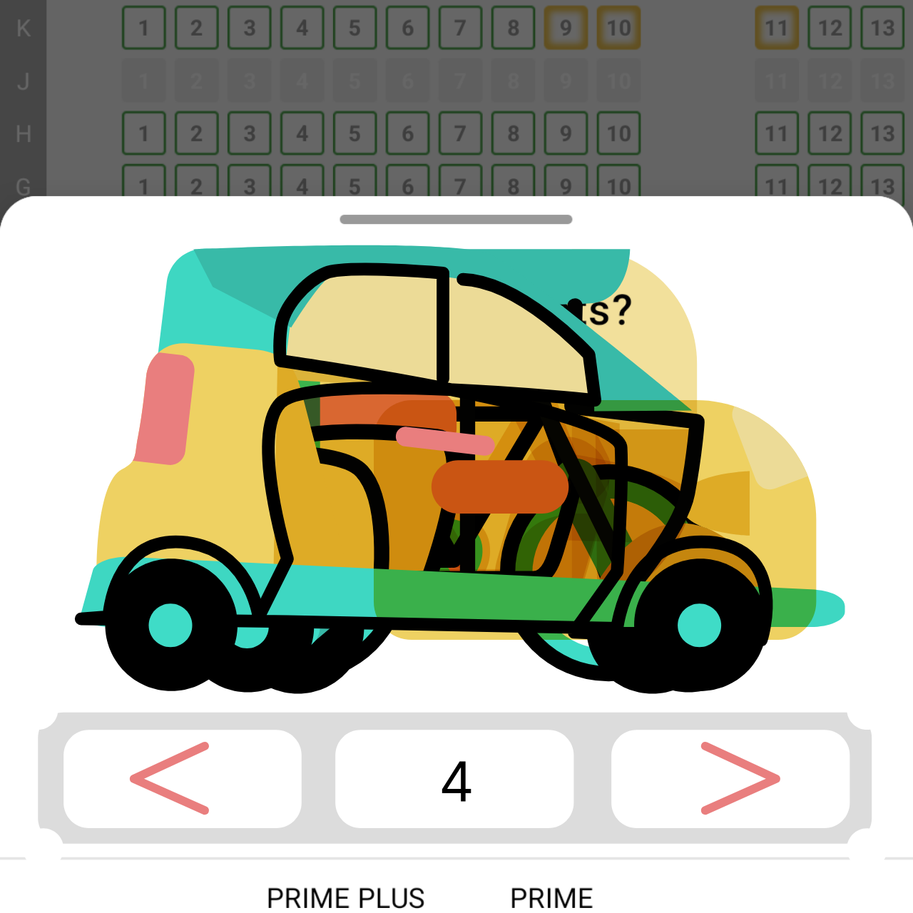
Book My Show is a booking app that uses vehicle assets to denote seat numbers. The user can toggle between them to select a seat. Two issues that I immediately noticed as a user:
Probem Statement
First, the asset design felt overly detailed and didn’t align well with the overall app aesthetic. The icons lacked a consistent visual identity in terms of color and shape.
Second, the interface felt very static, which stood out particularly compared to the rest of the dynamic UI.


Design

Color hierarchy: I noticed that the current illustrations followed 3 color palette in the following descending order: yellow, green and red. While redesigning the illustrations I followed the same color palette but more accentuated.
Shape and line identity: While working on the vehicle design, I decided to follow a familiar structure identity as I wanted them to be easily transformable into one another during animation.
All assets consist of a continuous line that defines the main shape of the vehicle.
Around this line, different modular shapes combine to form the vehicle. Similar elements like wheels and seat follow same color and shape for visible linearity.

Single line acting as a framework for each vehicle design

Exploded view showing modular shapes
Motion Approach
Two animation states were planned for vehicle interaction. The ideal state is the vehicle's motion in a loop animation. The transition state transforms one vehicle to another.

Idle state: Timing 30 frames
The idle state animation has a rhythmic bounce which starts from the wheel movement and translates to different shapes to give a fluid non cohesive movement.
Transition state: Timing 60 frames
In this state, the shapes of one vehicle rearrange and resize to form the next vehicle. I made sure that shapes of the same color morph into one another. During transition, common elements between vehicles, such as framework line and wheels, are used consistently to help direct the user’s eye in maintaining a smooth flow.

Transitions of framework line between different Vehicles

Modular shapes transform and repositon to form different Vehicles
Transition motion between different Vehicle designs
Interaction System
Rive state machine logic follows a set of listeners which are triggered (via Tap action/cursor down). The input changes with triggers, which leads to an animation state change.
Here, the listeners are positioned in the forward and back button.

In idle state 1 is the first vehicle animation (cycle, denoting 1 seat). With cursor down/Tap action on the forward button, the boolean for that particular transition (cycle to scooter) becomes true and the animation state changes to the transition state. As soon as the transition animation gets completed, it moves to the idle state 2 (scooter animation, denoting 2 seats).
With cursor down/Tap action on the back button, the same boolean input becomes false and inverse transition state takes place to arrive back at idle state 1.
A similar Trigger logic is used to animate forward and backward buttons.
Final Prototype